All posts filed under: Cover to cover

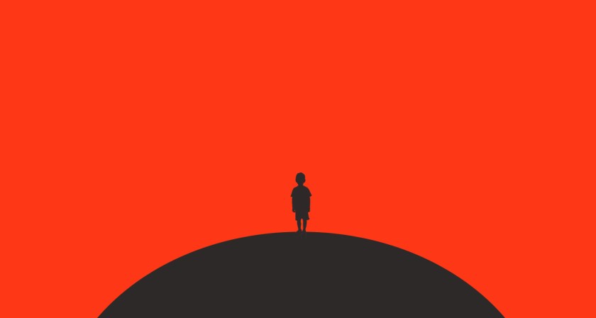
{A Reaper at the Gates} Cover Redesign

First things first. Have you read Sabaa Tahir’s An Ember in the Ashes series yet? I’m not a consistent fan of dystopian novels, but I’ll read them every once in awhile. Out of all the others like it that I’ve read (The Hunger Games, Divergent, A Darker Shade of Magic) this one is by far my favorite. The kickass female protagonist isn’t beholden to a love triangle or under the thumb of more powerful male characters. She’s independent and calls the shots all her own. The writing is that awesome, keeps you on the edge of your seat type. And the story has layers of mystery and magic with interesting twists at every turn. But alas… let’s just say, without going into too much critique, the cover’s not a style that I think represents what’s inside. So, it’s been awhile, but every so often I like to design a concept cover. Just for fun, what do I think the cover should look like? Some of the various covers to date . . .   After reading the …

{The Perks of Being a Wallflower} Cover Redesign

            The Perks of Being a Wallflower has a variety of covers to choose from. All of which I like. Even the “Major Motion Picture” cover is inviting (unlike most of its kind). But I liked the book so much I thought I’d do a redesign just for fun. Most of my inspiration came from an artist I recently found on Instagram. His artwork is simple, powerful and beautiful. It can tell one million different stories in just one image. And I found one that I thought captured Charlie’s (The Perks protagonist) story pretty well, so it seemed a perfect selection for this redesign… a young boy flying from a childhood swing set.   Image Source: Fajar P. Domingo Lettering: Katherine C.‘s handwriting Typeface: Helvetica    

{Betrayal} Cover Redesign

I‘m sure most of you have heard about this year’s Oscar winner for Best Picture: SPOTLIGHT. It’s an intense story about The Boston Globe’s special “Spotlight” team of journalists who, in the early 2000’s, investigated a decades-long conspiracy in the Catholic Church. And the book, Betrayal, is what the Spotlight team wrote after their years of award-winning investigative reporting. It’s a serious read that deserves a better cover than either of what’s currently out there. So, as I do on occasion (when having two kids under two-years-old will allow), I’ve re-designed an alternative cover for our March read. I tried to keep a subtle religious theme with the text and image column creating the shape of a cross, and then tying in the newspaper influence with the subhead copy being arranged in a way that’s similar to a newspaper column. I think if Betrayal actually hit the shelves with this cover, the book could reach a whole new audience! But, for now we’ll just keep it between us until my little ones grow up and I have …

{The Handmaid’s Tale} Cover Redesign

    The Handmaid’s Tale has a rather recognizable cover… and that’s probably because the old version has been around for such a long time. So, to freshen it up, I wanted to bring it into a new era. The timeline in the book is fairly ambiguous, but if you make it all the way to the end, 1980’s cassette tapes play a significant, and rather mysterious, role. Their appearance in the story is till making me think and wonder. This inspired me to use the 80’s as inspiration for a new cover. I wanted something to show off the cassette tape, have an 80’s feel to the style, and still feel a little eerie (in keeping with the tone of the book). So without further a due, here’s a look at my redesign…    

{Their Eyes Were Watching God} Cover Redesign

In the years since this book was published, there have been quite a few iterations of the cover design. None of which have been terrible, but I figured it’d be a fun redesign none-the-less. This design was inspired by the reoccurring theme of the pear tree (among others). Early on in the story the young protagonist, Janie, sits beneath a pear tree and ponders life and love. All in one, the tree symbolizes her memories, hopes, and the blossoming of her dreams. And then throughout the story Hurston uses the pear tree, and others, as symbols of Janie’s life… “Janie saw her life like a a great tree.” So, here it is…   Title Font: Hitalica Caption Font: Georgia Pear Illustration: “The Beurre Diel Pear” Augusta Innes Withers, Hand-colored Engraving  

{Ender’s Game} Cover Redesign

I thought the hyper-scifi, ultra-nerd Ender’s Game cover could use an update. No offense to those scifi covers, they definitely serve their purpose. But I thought it’d be fun to rethink the look for Ender’s Game (it’s been a long time coming). Since the book was first published in early eighties, I thought something colorful and slightly retro was fitting. And if you’re a fan, you’ll notice I used the colors of the Dragon Army color code… it seemed appropriate 🙂 Ultimately, as I was reading Ender’s Game I just had this image in my head of a young boy overwhelmed and surrounded by different pressures, looking so child-like and alone…        

{Still Alice} Cover Redesign

Hello! I’m sure you recognize these images as the poster for the movie and the original book cover. The movie poster was re-purposed to serve as a book cover shortly after the film was produced… and, well, there’s nothing I hate more than a “now a major motion picture” book cover! I get it. If you make a movie of it you want to show it off. But inevitably the “motion picture” cover ends up looking like a cheap ad (admittedly, I’ve seen worse). In the case of Still Alice I definitely like the original butterfly cover best, and it pulls from a good theme in the book. But I figured the cover could use a makeover. Granted, this won’t always be the case with every book we read for Bookly, but for Still Alice I designed TWO new cover options…     Alice is a character of such intelligence and motivation, and suddenly she finds herself losing her every day independence; a trait that defines so much of who she is. Was? And the first time we witness her symptoms is when she’s out for one …

About the Cover Art Project

Hi all! I love books, everything about them. I especially love the art and design of book covers. In my work life I do a lot of graphic design, and it’s always been a dream of mine to design books covers. Although I don’t do it professionally, I thought Bookly would be the perfect place to share some cover redesigns and inspirations! So every once-in-awhile I’ll redesign a book cover for a book we read here at The Bookly Club, or another favorite from my list. In the meantime, I thought I’d share with you one of my favorite covers. It also happens to be one of my favorite books. In Cold Blood is a frightening novel by Truman Capote published in 1966.  It’s the true story of a family murdered, in cold blood, in rural Kansas in 1959. Reading this book put me on the edge of my seat and made me fearful of ever being home alone. It’s a haunting classic and I HIGHLY recommend putting on your reading list. As published by Flavor …